
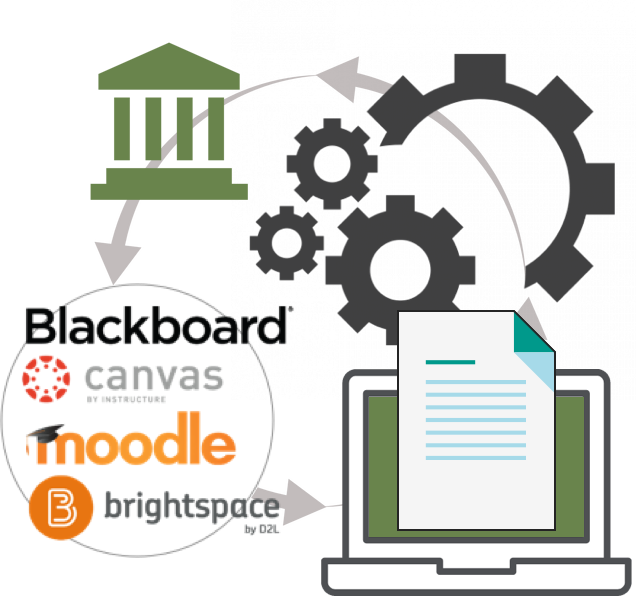
LMS Content Integration
Providing administrators and educators seamless search, discovery, adoption, and re-use of next-generation digital content from within the Learning Management System (LMS) environments used to teach their higher education courses.
ROLE
Senior UX Product Owner
Sole UX Lead
Interaction & Visual Design
TEAM
Product Management (4)
UI Designers
Overseas Development teams (4)
Research Specialist
Dedicated UA Writer
DURATION
March 2016 - June 2020
RELEASES
Iterative/Ongoing
PROBLEM
We literally had educators jumping through windows.
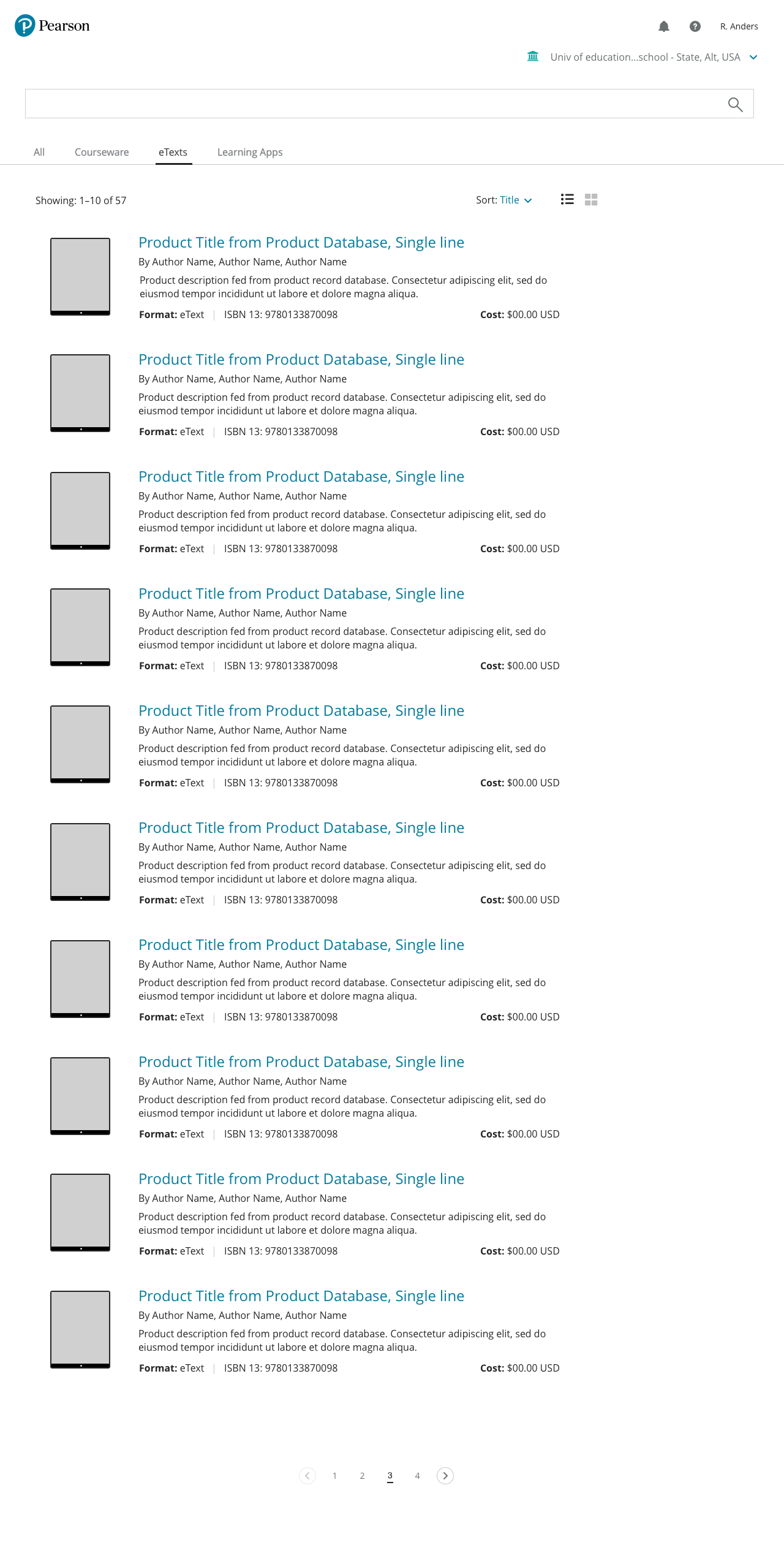
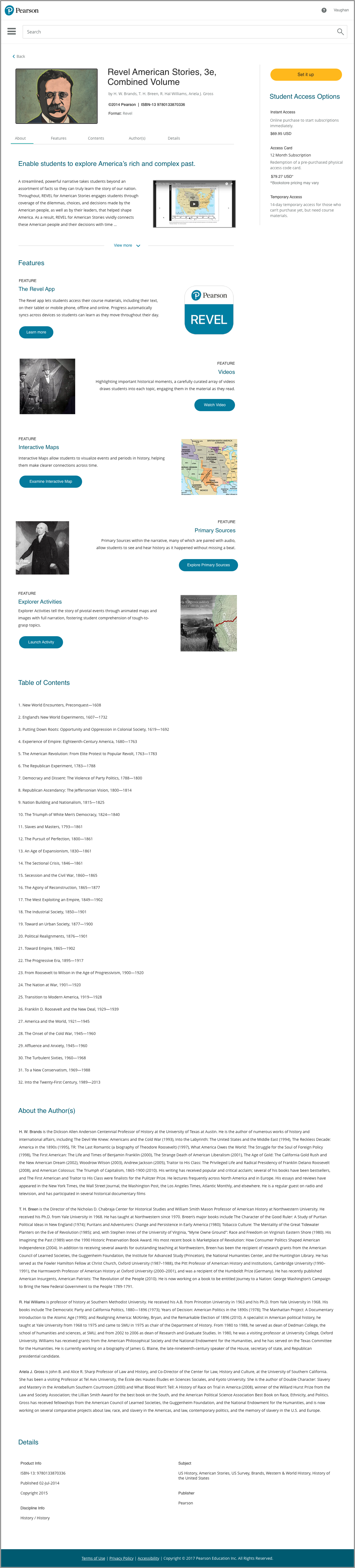
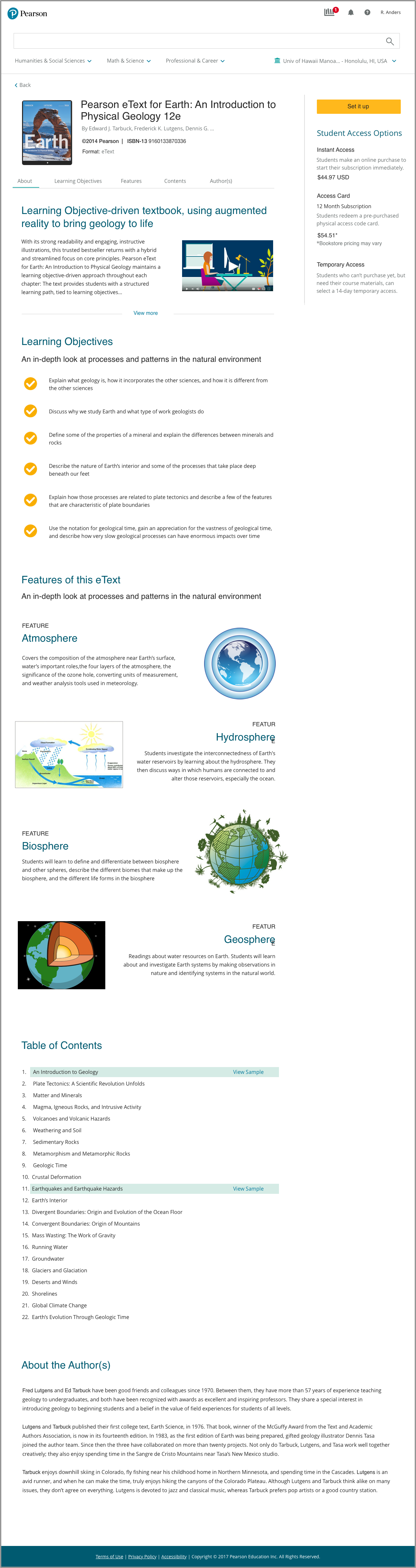
The current onboarding experience opened multiple tabs and windows to complete the basic task of adding Courseware, Etexts, and Learning Apps to their courses.
The individual pages had their own URLs, styles, headers, footers, and visual elements. The brand was non-existent.
The user journey was disjointed and led to a decline in North American adoptions of our new product lines.

SOLUTION
Let’s not do that!
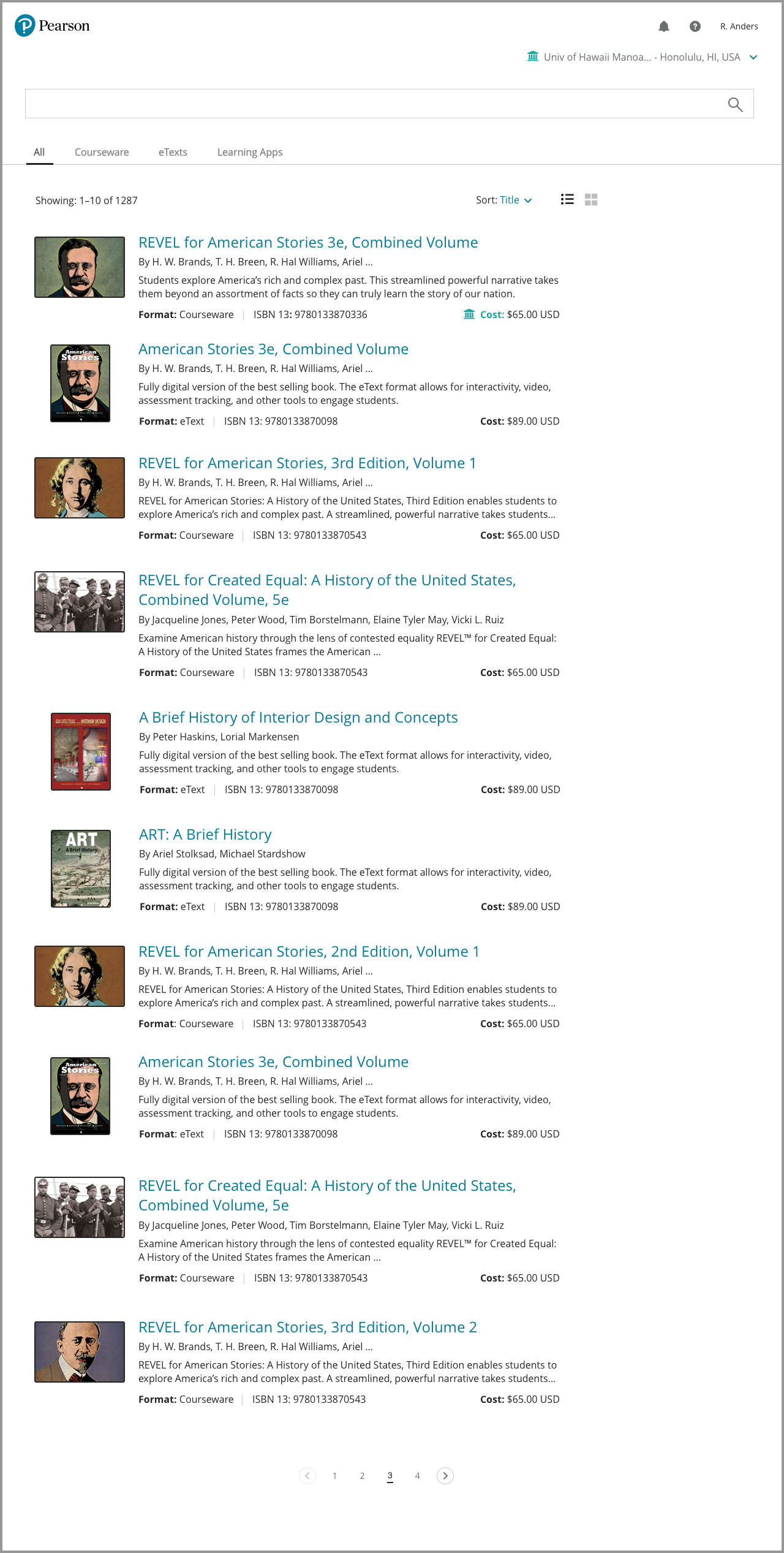
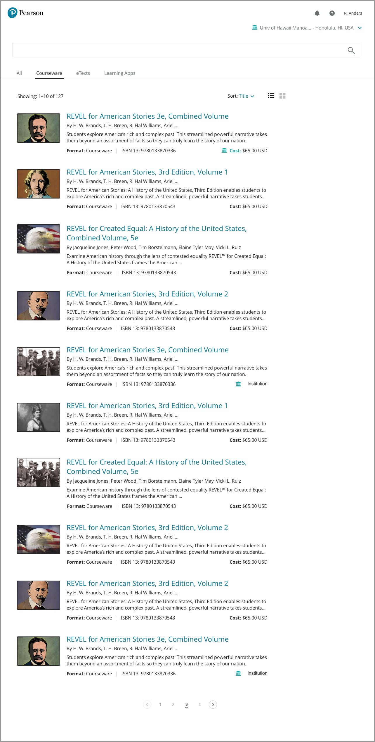
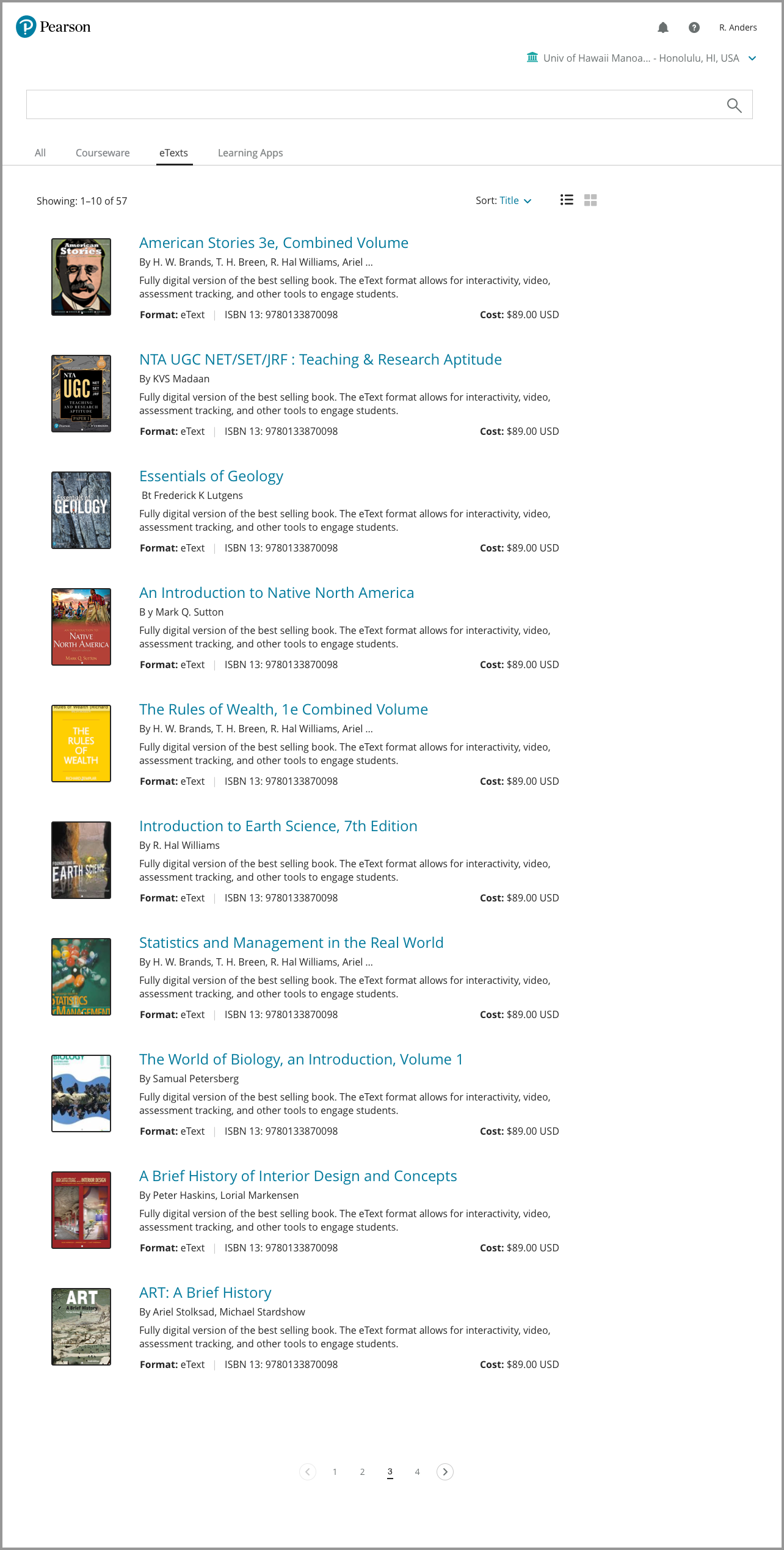
Utilize APIs and Components to deliver a seamless, single-page experience inside of the required iFrame used to integrate services and capabilities within LMS environments.

PROCESS
Understanding the needs.
Partnering with Research Specialists, interviews were conducted and recorded with groups of admins and educators who currently used our products. They were asked to walk through the current onboarding experience and voice their thoughts and pain points.
Interviews were also conducted with university staff and instructors at multiple national education conferences. They were asked why or why not they would adopt our products.
Existing Customers
Although the content met their learning objectives. The research surfaced frustration with the time on task and complex window management.
What mattered
Simplifying the current onboarding process
Time on task
Courseware Integration from within their school websites.
Customers not using our products
The complexity of onboarding our products and lack of integration services was enough to consider other publishers.
What Mattered
Simple onboarding and integration
Content that met learning objectives
Time on task
Setting up and teaching courses from within their school websites
IDEATION
Setting the product goals
Allow university admins and instructors end-to-end Course Setup from within the Learning Management System used at their schools.
Simplify the current process allowing adoptions, capabilities, and services to be displayed from within the LMS embedded in the university websites.
Use APIs, single-source CSS, and components to deliver a seamless experience the carried the brand.
Remove all complexity to reduce time on task.
Using Jira, create Epics and write UX user stories to establish roadmap deliverables.
IDEATION
Research
Recapping the testing data
The supplied data showed instructors and students had strongly voiced their preference to onboard, teach, and learn from within their university websites.
The existing data also revealed frustration and mistrust with the many windows and tabs needed to complete simple onboarding tasks.
Each LMS looked and felt different. Fonts, colors, and general page design elements were inconsistent.
Getting started
I shared research findings and documentation with the cross-functional team to clearly define user needs and pain points.
I performed a heuristic analysis of the current UXUI display and user flows associated with each LMS being supported.
I analyzed the unique codebases implemented by the individual dev teams and surfaced the key differences and visual inconsistencies between the 4 LMS environments..
IDEATION
Laying out the ecosystem.
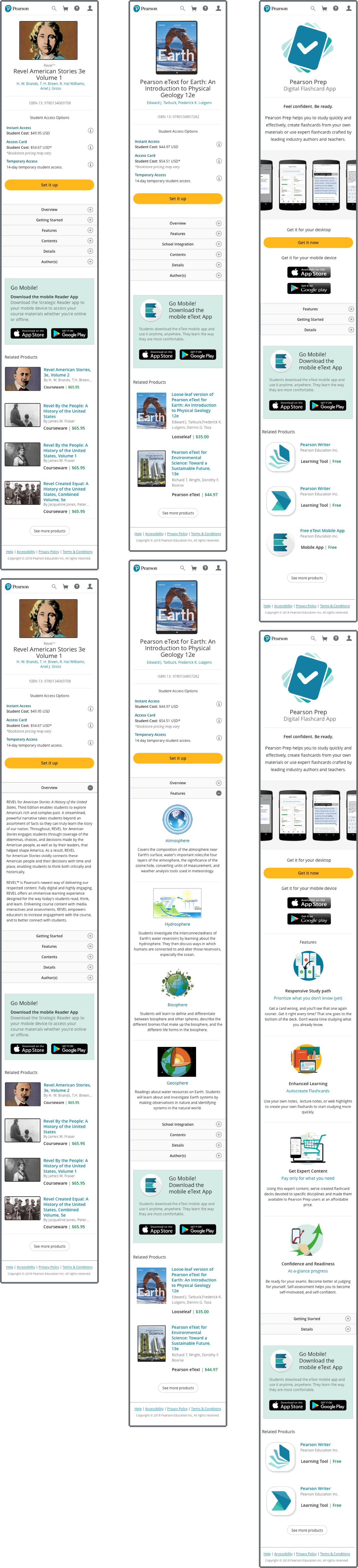
The first phase design goal was to update the UXUI, inline sequence the user flows, and establish a single CSS codebase shared between dev teams.
Idea generation
I led drawing and whiteboard sessions with UX peers to gather varied ideas and interaction concepts.


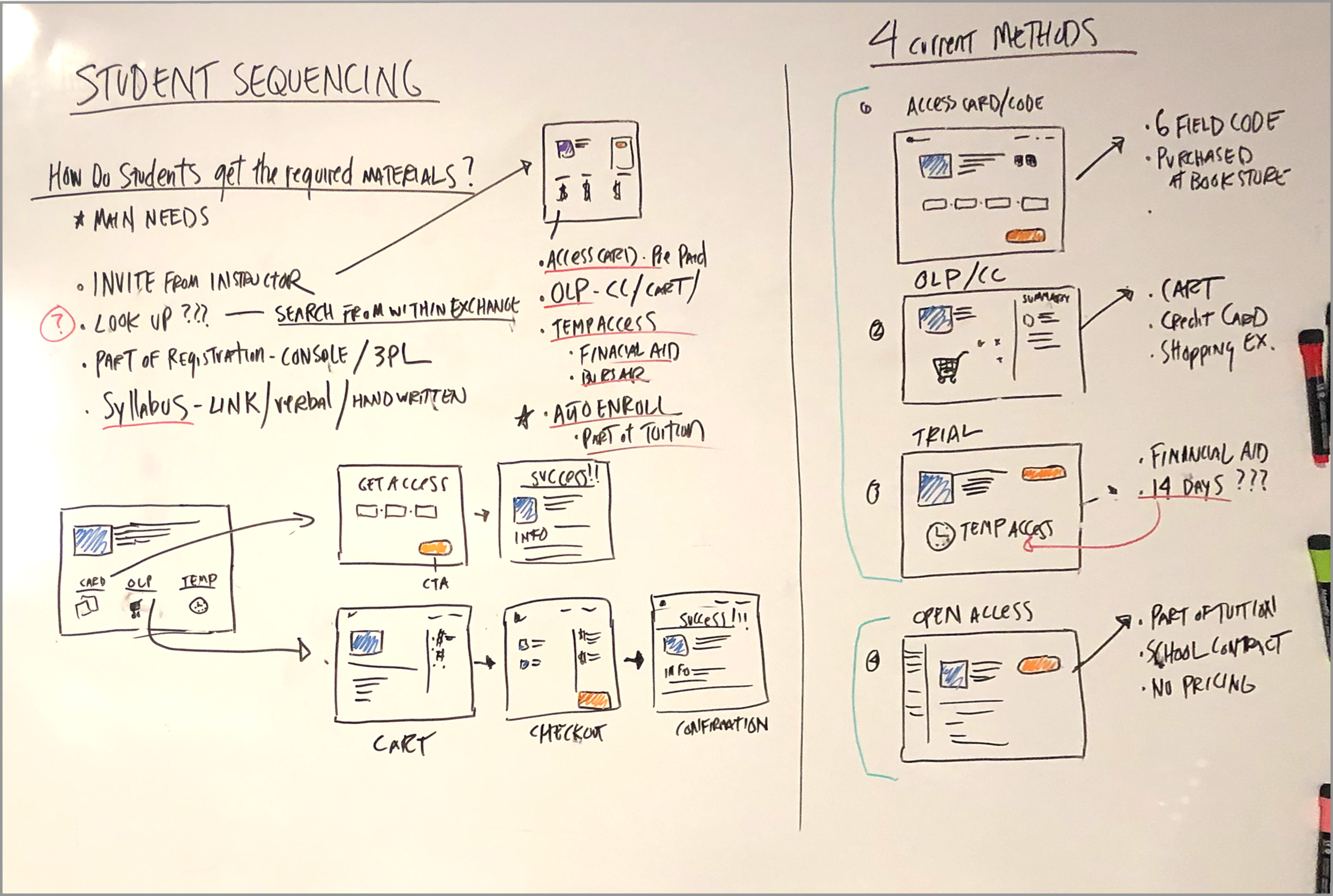

Framing it all out.
Defining of the information architecture.
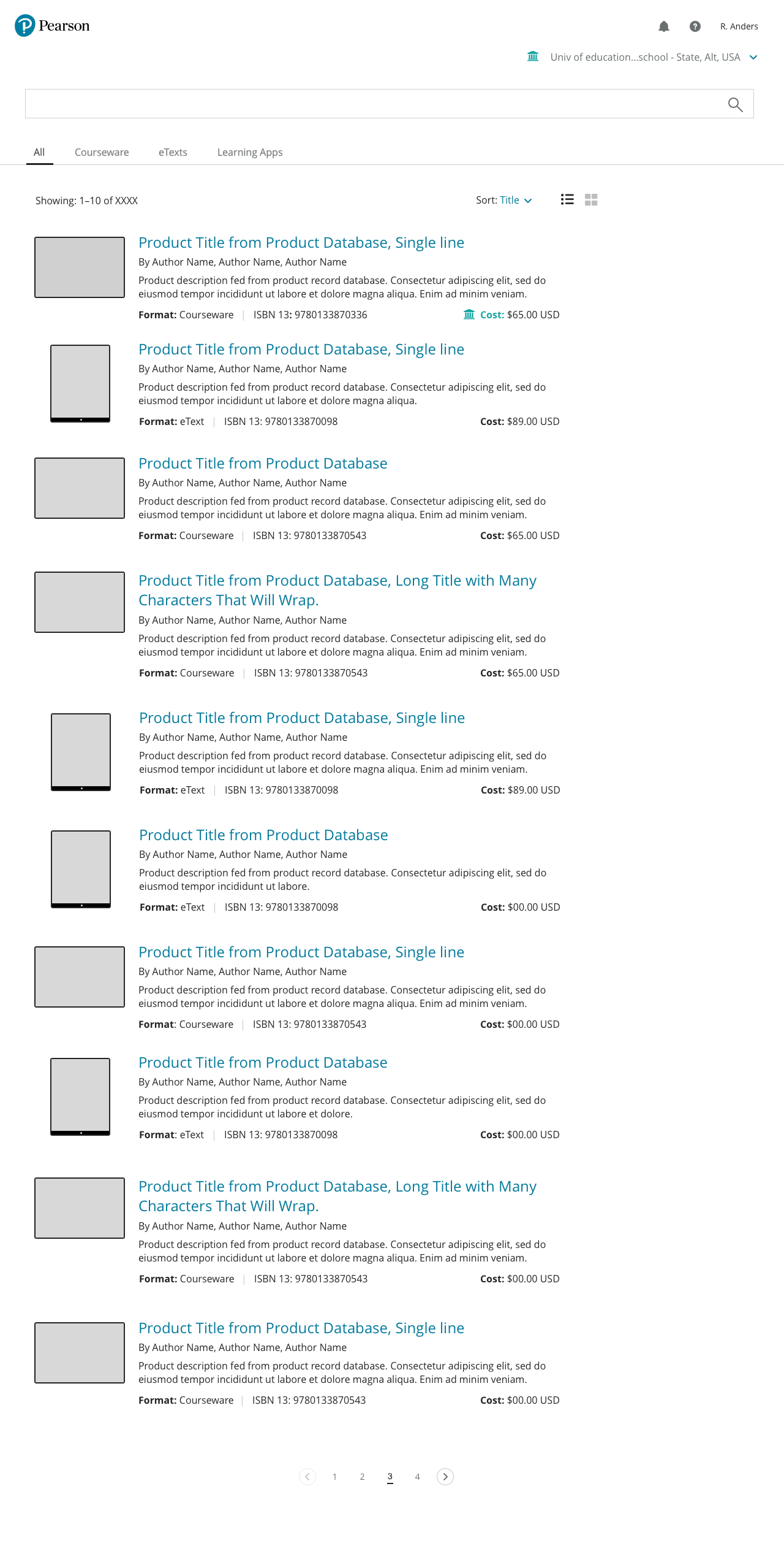
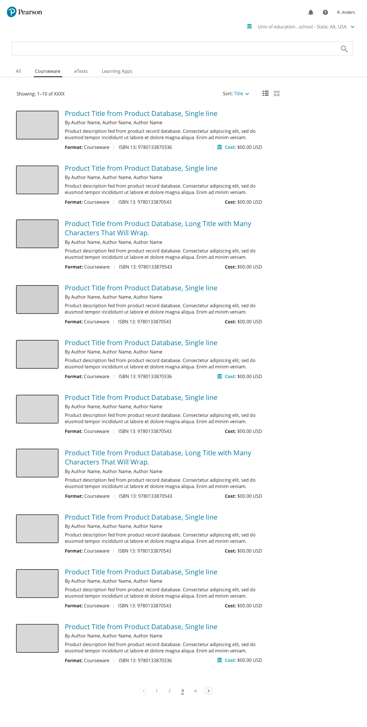
Using a mix of the Adobe Creative Suite and Sketch, I created wireframes working with the Visual Design team adhering to new branding guidelines.
I presented the UXUI to stakeholders, product management, and overseas development teams. The consensus was that it met end-to-end user and business needs, and was viably sound to be placed into the Agile environment.
A little more testing.
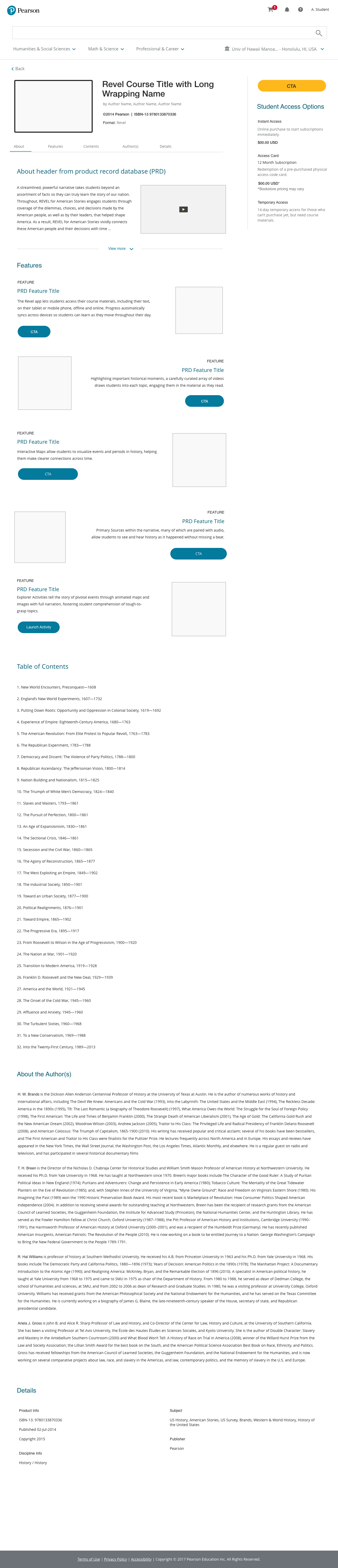
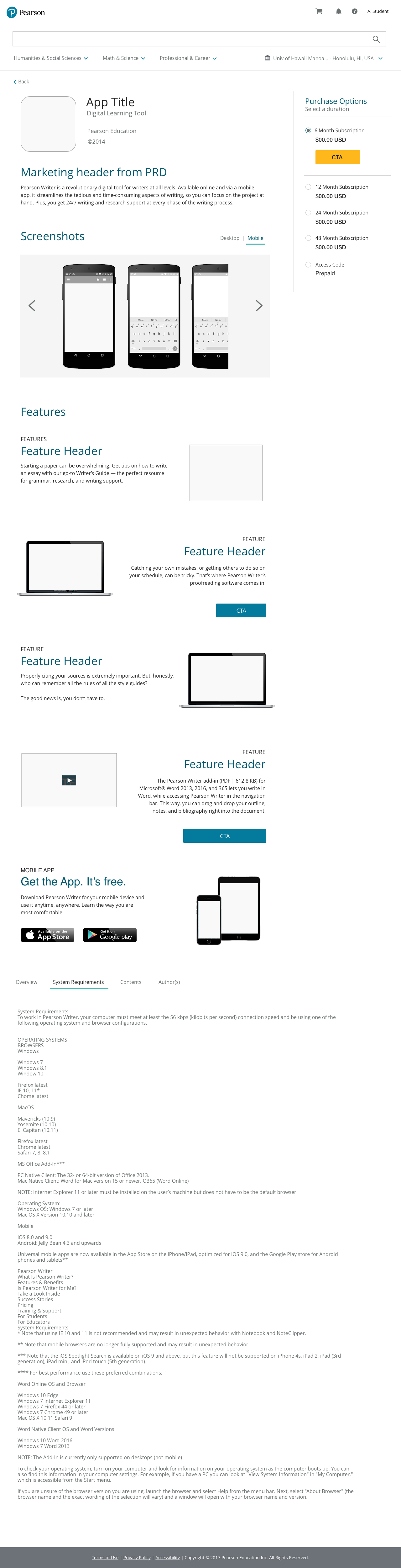
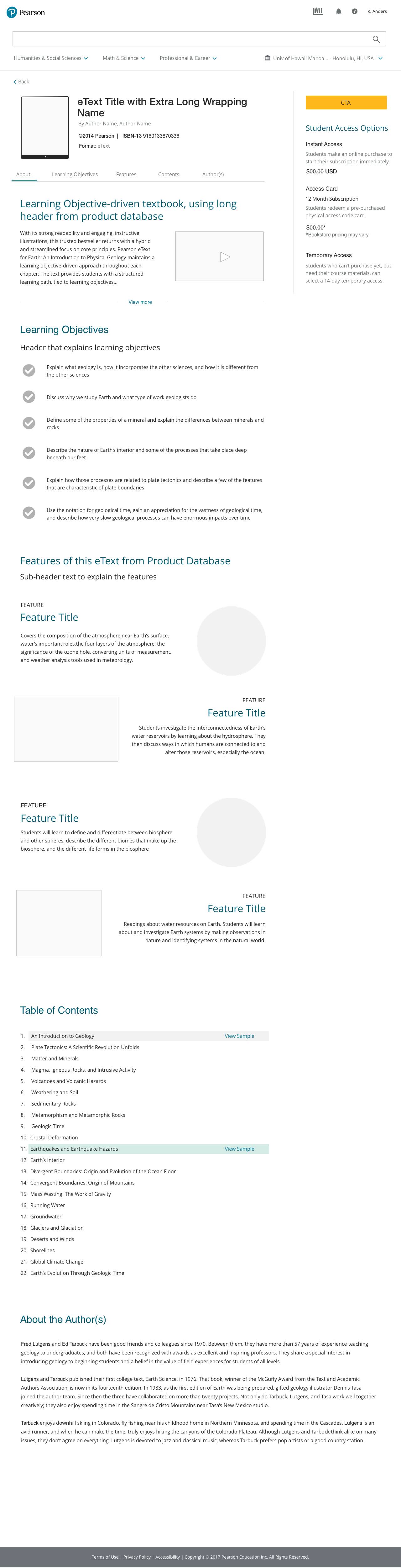
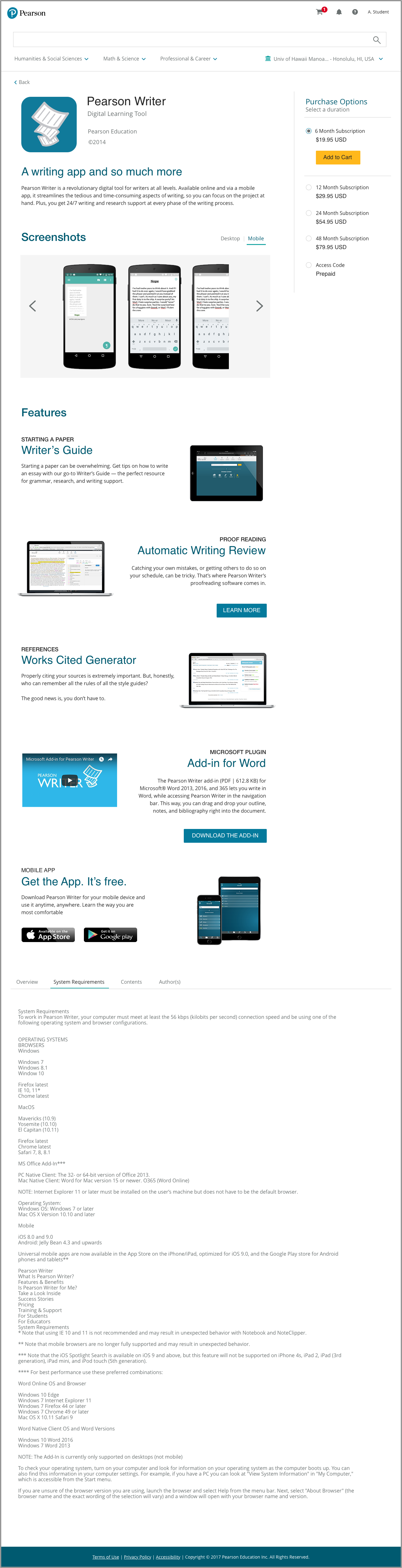
The Product Detail Pages needed some more attention to inform the design decisions on user preferences for navigation and page element priority.
A secondary round of testing was conducted with educators to finalize the information architecture. Partnering with research specialists, we created a simple card sorting exercise and scripted the interview questions. The wires were presented for reference.
PROTOTYPING
Putting it all together.
High-fidelity prototypes and live clickthroughs.
With the interaction and page sequencing defined, live product shots and metadata were used to create final prototypes.
Using InVision, highly interactive clickthroughs were created simulating a live experience.

USER TESTING
Making sure we got it right.
To validate the design, a group of 10 instructors were presented with “live” InVision clickthroughs and asked to perform start to finish tasks to locate and onboard specific products. The sessions were recorded.
Interview questions, before and after the usability tests, supplied empathy for customer thoughts, needs, feelings, and wish list items.
How did users search?
Depends. Prefered methods were split between participants. Interestingly, the preference was closely related to academic disciplnes.
Could users find educational content for their courses?
Yes. Easily. 9 out of 10 instructors were able to successfully complete their tasks.
How much effort was involved?
No time at all. 90% voiced finding their products was a quick and simple process.
Was it usable?
A SUS score of 86 was achieved. The navigation was understood, and the experience was familiar.
Would they recommend it?
Absolutely. All participats said they would recommend the platform to their peers.
GOING TO PRESS
Pixel perfect production.
Language, tone, and brand.
Working closely with UA writers, finalized language reviews were conducted for navigation and button labels, error messaging, and informational prompts.
Matching the code to the design.
Using a mix of InVision for reference, and Zeplin for accuracy, final RWD prototypes, and concise redlines were delivered to the development team.
Auditing
I attended weekly demos to ensure the code display matched the intended design. I supplied feedback, submitted bug reports, and quickly solutioned problematic issues.

RELEASE
It seemed we got it right.
The platform was generating over 20M dollars in annual revenue. During the next 3 years, usage grew at a steady rate, and the market share increased from 16% to 63%. The platform was generating over 125M dollars per year.
How did we know?
Using a mix of Product Support data, Google analytics, and follow-up interviews, the data showed the platform design to be successful in meeting user needs.
Users were searching and browsing, with search being more common, and spent little time locating their courseware.
User time on task data showed the largest percentage of time was spent on the Product Detail pages. This was an acceptable and expected measure.
Usage was up over 40%.
Task completion, search through final adoption, was easily achieved with little issues.
Product support calls were almost non-existent, and usually attributed to system failures and/or bugs.
Dropoff rates became less increasing over time.
CHALLENGES
Some bumps in the road.
Not everyone was on board with the concept of a single marketplace.
Product owners did not want to share the space with other products in the protection of their bottom lines.
This proved exceptionally challenging, especially with a large portion of personas specifically included ways of teaching that used many different types of content to create their course curriculum.
We could not control what went into the end-user displays.
The imagery and metadata were governed by the individual product teams via the admin tool. These were not designers or copywriters. Users did not know this. Users only thought we liked ugly broken images and bad descriptive text.
The Visual Design System was in constant flux.
The Visual Design team was designing the pattern library for a specific product. There were many new page elements that needed to be incorporated into the design system.
MOVING FORWARD
Making it better.
The basic Search and Discovery was in a good place, and the numbers showed promise. Developing new features was a natural evolution for the product, and supported the growing customer needs. Ideation began to roadmap the release plan.
Iterative enhancements.
Search Bar - Adding auto-complete and suggestive search.
Relationship Engine - Displaying related products in sidebars and carousels.
Filtering - Refining search results.
Admin Panels - More robust managing and governing of the product records to dynamically display metadata, availability, and student pricing.
Ad Placements - Marketing blocks to create awareness for new products and services.
Offering more products - Adding in all of the NextGen product suite, including eTexts and Learning Apps. The most insightful response from users when showed the full suite of new products offered within the system during early testing… "I didn’t know Pearson had all this stuff!“