Providing a seamless LMS onboarding experience
Phase 1 Updating of the existing UXUI and streamlining user workflows into a single-page content integration experience
The Challenge
Allow administrators, instructors, and students easy adoption, purchase, and online access to next-generation Courseware, eTexts, and Learning Apps without leaving their university websites.
Hypothesis
The antiquated UXUI hadn’t been touched in years. Start by recreating the pages using elements from the new pattern library.
Collaborate with engineering teams to establish a single shared code base for presenting the UXUI configurable for each respective LMS system.
Allow university admins and instructors end-to-end Course Setup from within the Learning Management System used at their schools.
Provide students the ability to onboard, procure and access their instructor required course content without leaving their school website.
Overview
The customer experience for onboarding our next-generation courseware was disjointed and unpleasant, leading to a decrease in North American adoptions.
The first phase design goal was to update the UXUI, inline sequence the user flows, and establish a single CSS codebase shared between dev teams.
Roles and Responsibilities
My Role
Senior UX Lead (sole), Interaction & Visual Design, User Testing, Wireframing, Prototyping, Redlining
The Agile Team
Product Manager, 3 Project managers, Lead UX Designer, UA Writer, Lead Web Dev Manager, 4 Overseas front and back-end development teams.
The Tools
Sketch, Adobe Creative Suite (Diagrams, charts, wireframes, prototypes, redlines).
InVision, Mural (Clickthroughs, sequencing, User Testing).
Jira (planning, project management)
The Timeline
Project start: March 2016
Release: December 2016
Subsequent releases: Iterative/Ongoing
Scope & Constraints
No other UX resources were granted to the project.
Resources for research were not allocated.
Getting up to speed on the project
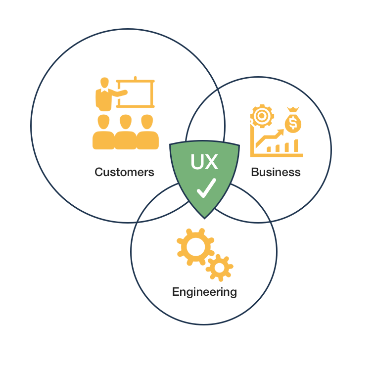
Identifying user needs, business concerns, and engineering requirements
Preliminary Research
Assessing the current development effort
I used existing research documentation provided by the management team to identify user needs and pain points.
I performed a holistic analysis of the UXUI display and user flows associated with each LMS being supported.
I analyzed the unique codebases implemented by the individual dev teams and surfaced the key differences and inconsistencies.
Results
The supplied data showed instructors and students had strongly voiced their preference to onboard, teach, and learn from within their university websites.
The existing data also revealed frustration and mistrust with the many windows and tabs needed to complete simple onboarding tasks.
Each LMS looked and felt different. Fonts, colors, and general page design elements were inconsistent.
Challenges
Our individual Search, Onboarding, and Student Procurement systems were not designed to be displayed and sequenced in an iframe.
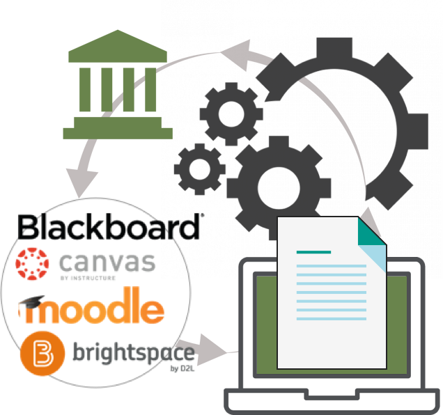
Integrating within an iFrame was necessary for 3 of the 4 Learning Management Systems (LMSs).
The LOE to update the codebase and create APIs would be significant.
Creating an inline, sequenced experience would be dependant on outside systems being able to pass data from Profiles, Accounts, eCommerce, and Student Course Registration.
Ideation is great if you have the time
Throwing standard UX practices out the window and designing in real-time
First, an immediate facelift
The antiquated UI hadn’t been touched in years. My first priority was to update the current UI using high fidelity prototypes and proposed a single CSS solution by supplying redlines.
Rapid design iteration
Bringing the UI into this century
I recreated the UI with High Fidelity Prototypes, using Sketch and a new design library.
I incorporated live product imagery and metadata accounting for the 4 LMS systems that we would need to integrate our content.
The interaction design was left as-is. This would be addressed in the next iterative phases.
The final designs were presented to product managers, stakeholders, and development teams for unified sign-off on the final customer experience.
Sign-off was unanimous. I then created and delivered single-source CSS redlines to Dev managers to be shared by all 4 development teams.
Rolling the dice
With the pages updated and the CSS accounted for, I made the decision to forgo usability testing and approved the UXUI to go straight to press.
Page Sequencing
User Flow Sequencing
I created System Interaction Maps embedding the sequenced Course Creation, the Marketplace, and Student Onboarding systems into the respective LMS shells.
I collaborated with Engineering to assure the architecture was sound and scalable.
Adjustments and finalized maps were completed based on final feedback from the team.
A dedicated InVision Project was created as a single source of record to illustrate user flows and define page sequencing.
End to End Testing
Putting the new screens and inline workflow in front of users to confirm my hypothesis
Usability and Likeability
Using InVision, I created a clickthrough that mirrored the live experience in development.
Tasks were given to 10 instructors who already used our products that included installing the Pearson app, finding specific content from the Marketplace, and final set up of the course content.
Observations included:
Task Success Rate
Time on Task
System Usability Scale (SUS)
5ST Methodology - Questions added to the SUS
Results
90% of instructors found the system easy to navigate and less timely than the current version.
The subjects unanimously preferred the new workflow.
SUS ratings received an average of 9 (second highest) amongst all participants.
All participants thought the page designs were visually pleasant and welcoming.
Some instructors had difficulty selecting the sample content. This was attributed to unfamiliarity with the US History product samples used. The instructors used for the testing taught other disciplines such as Arts or the Sciences.
Outcome
The new design and workflows met 85% of user expectations.
All of the test subjects thought the simplified onboarding experience was quick and easy, giving them more time to create their lesson plans.
No revisions would be needed for the in-flight development.


